-
Architects: HNTB Architecture
- Year: 2015
-
Photographs:Assassi Productions
-
Manufacturers: Alucobond, ASC Steel, Construction Specialties

Text description provided by the architects. What makes an iconic design? This was the first question we asked ourselves at the beginning of the design process. This was going to be, after all, a highly visible structure at one of the most iconic airports in the United States at one of them most design-oriented cities in the world.

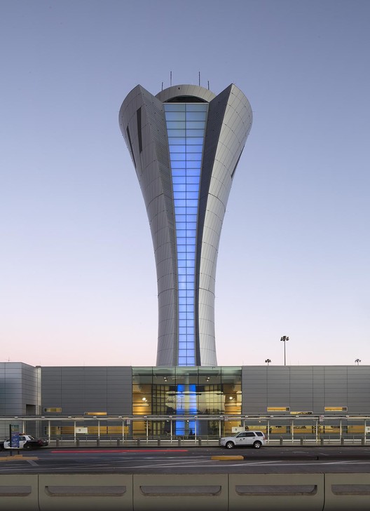
The goals of both the Airport and the Architect were to reflect the SFO brand with an elegant form and welcoming gesture to the public. This is directly manifested in the sweeping torch form and the impetus for opening of the tower shell to expose the ‘core’ with a back lit glass facade which greets passengers arriving along the upper level roadway and train. The intent was to provide a sleek and elegant façade with a subtle but dynamic skin with spiraling aluminum panel joints around the conical surface.
.jpg?1452033491)
At the same time we saw an opportunity on the location of the tower. Unlike towers at most airports, SFO’s is immediately adjacent to drivers and pedestrians. We wanted people to experience the tower up close as well as from afar. The tower comes down on to a glass box at a public connector between terminals 1 and 2. This moves makes the tower appear taller from the roadway while providing passengers dramatic views from the base of the tower.

Though effortless in appearance, the elegant form shrouds a feat in engineering and functional design. The aluminum skin conceals 75,000 pounds of steel weights to resist wind and earthquakes as well as the large amounts of high tech equipment needed to run a modern airport terminal.


.jpg?1452033491)
.jpg?1452033470)

